Button
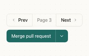
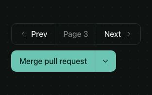
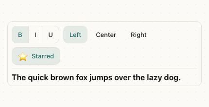
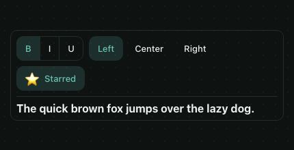
A pressable button with a label, in six variants and four sizes. Every size keeps a 44pt touch target, and the web shows a focus ring when it's reached by keyboard.
<Card style={{ maxWidth: 380, width: '100%' }}>
  <CardHeader>
    <CardTitle>Order summary</CardTitle>
  </CardHeader>
  <CardContent style={{ gap: 8 }}>
    <HStack justify="space-between">
      <Text color="textSecondary">Linen shirt × 2</Text>
      <Text>$78.00</Text>
    </HStack>
    <HStack justify="space-between">
      <Text color="textSecondary">Shipping</Text>
      <Text>Free</Text>
    </HStack>
    <Separator />
    <HStack justify="space-between">
      <Text weight="semibold">Total</Text>
      <Text weight="semibold">$78.00</Text>
    </HStack>
  </CardContent>
  <CardFooter style={{ flexDirection: 'column', alignItems: 'stretch' }}>
    <Button size="lg" loading={paying} startIcon={<Icon name="lock" color="onPrimary" size="sm" />} onPress={pay}>
      {paying ? 'Processing…' : 'Pay $78.00'}
    </Button>
    <Button variant="ghost">Back to cart</Button>
  </CardFooter>
</Card>
Try the props
variantsizestartIconendIconhrefstylesdesign<Button>Save changes</Button>
Examples
Each example is live: edit the code and it runs.
Follow a creator
A creator's profile: Follow turns into an outlined Following once the request is done, a spinner shows while it's on its way, and Message is a quieter outline button with an icon.
<Card style={{ width: '100%', maxWidth: 380 }}>
  <CardContent style={{ gap: 16 }}>
    <HStack gap="md" align="center">
      <Avatar size="lg" name="Inés Moreau" src="https://picsum.photos/id/65/160/160" />
      <VStack style={{ flex: 1 }}>
        <Text weight="semibold">Inés Moreau</Text>
        <Text size="sm" color="textSecondary">Ceramics and slow travel · {following ? '12.5k' : '12.4k'} followers</Text>
      </VStack>
    </HStack>
    <HStack gap="sm">
      <Button
        style={{ flex: 1 }}
        variant={following ? 'outline' : 'default'}
        loading={busy}
        startIcon={following ? <Icon name="check" size="sm" /> : <Icon name="userPlus" size="sm" color="onPrimary" />}
        onPress={toggle}
      >
        {following ? 'Following' : 'Follow'}
      </Button>
      <Button variant="outline" startIcon={<Icon name="mail" size="sm" />}>Message</Button>
      <Button size="icon" variant="ghost" accessibilityLabel="More options">
        <Icon name="more" />
      </Button>
    </HStack>
  </CardContent>
</Card>
Variants
default is filled with the theme's primary color. Use one per screen for the main action, and secondary, outline or ghost for the rest. destructive is for actions that delete or can't be undone; link looks like a text link.
<HStack gap="sm" wrap>
  <Button>Default</Button>
  <Button variant="secondary">Secondary</Button>
  <Button variant="outline">Outline</Button>
  <Button variant="ghost">Ghost</Button>
  <Button variant="destructive">Delete</Button>
  <Button variant="link">Link</Button>
</HStack>
Sizes
sm, default and lg change the height and the text. icon is square; give it an accessibilityLabel, since it has no text to read.
<HStack gap="sm" align="center" wrap>
  <Button size="sm">Small</Button>
  <Button>Default</Button>
  <Button size="lg">Large</Button>
  <Button size="icon" accessibilityLabel="Add">
    <Text color="onPrimary" size="lg">+</Text>
  </Button>
</HStack>
Loading
loading shows a spinner in place of the start icon and blocks presses, so a form isn't sent twice.
<Button loading={saving} onPress={save}>
  {saving ? 'Saving' : 'Save'}
</Button>
Icons
startIcon and endIcon take any node, such as an icon from your icon set.
<HStack gap="sm" wrap>
  <Button startIcon={<Icon name="mail" color="onPrimary" size="sm" />}>Send</Button>
  <Button variant="outline" endIcon={<Icon name="arrowRight" size="sm" />}>Next</Button>
</HStack>
Icon buttons
size="icon" makes a square button for a toolbar. It has no text, so give it an accessibilityLabel, and add a Tooltip on the web so pointer users can read it too.
<HStack gap="xs">
  {ACTIONS.map(({ icon, label }) => (
    <Tooltip key={label} content={label}>
      <Button size="icon" variant="ghost" accessibilityLabel={label}>
        <Icon name={icon} />
      </Button>
    </Tooltip>
  ))}
</HStack>
Disabled
disabled dims the button and blocks presses. Prefer explaining what's missing over a dead button: here the label says why it can't be pressed yet.
<VStack gap="md" style={{ maxWidth: 360 }}>
  <Checkbox label="I agree to the terms of service" checked={agreed} onCheckedChange={setAgreed} />
  <Button disabled={!agreed}>{agreed ? 'Create account' : 'Accept the terms to continue'}</Button>
  <Button variant="outline" disabled>Export (Pro only)</Button>
</VStack>
Full-width sign-in buttons
In a row, a button is as wide as its label and centered with the other items. In a column it stretches to the full width, as primary actions on phones do; give it style={{ alignSelf: 'flex-start' }} to keep it to its label.
<VStack gap="md" style={{ maxWidth: 360 }}>
  <TextField label="Email" placeholder="[email protected]" keyboardType="email-address" autoCapitalize="none" />
  <TextField label="Password" secureTextEntry />
  <Button variant="link" style={{ alignSelf: 'flex-end' }}>Forgot password?</Button>
  <Button size="lg">Sign in</Button>
  <Button size="lg" variant="outline" startIcon={<Text>🍎</Text>}>Continue with Apple</Button>
</VStack>
Delete a workspace, with a confirmation
Pair a destructive button with an AlertDialog, so a slip of the finger can't delete anything. The cancel button is outline, and it takes focus first.
<Card style={{ maxWidth: 380, width: '100%' }}>
  <CardHeader>
    <CardTitle>Delete workspace</CardTitle>
    <CardDescription>Removes 14 projects and 3 members. This can't be undone.</CardDescription>
  </CardHeader>
  <CardContent>
    <AlertDialog>
      <AlertDialogTrigger>
        <Button variant="destructive" style={{ alignSelf: 'flex-start' }}>Delete workspace</Button>
      </AlertDialogTrigger>
      <AlertDialogContent>
        <AlertDialogHeader>
          <AlertDialogTitle>Delete “Acme Design”?</AlertDialogTitle>
          <AlertDialogDescription>All 14 projects will be deleted for everyone.</AlertDialogDescription>
        </AlertDialogHeader>
        <AlertDialogFooter>
          <AlertDialogCancel>Keep it</AlertDialogCancel>
          <AlertDialogAction variant="destructive">Delete</AlertDialogAction>
        </AlertDialogFooter>
      </AlertDialogContent>
    </AlertDialog>
  </CardContent>
</Card>
Save a draft or publish
Show loading while the request runs, then confirm with a toast. The button blocks presses while it's loading, so the request isn't sent twice.
<View style={{ height: 200 }}>
  <HStack gap="sm">
    <Button variant="outline">Save draft</Button>
    <Button loading={busy} onPress={onPublish}>Publish</Button>
  </HStack>
  <Toaster />
</View>
In real apps
Patine Pro screens built with it. Each opens on that screen, live, in the screens gallery.
Designs
Patine's look is the same everywhere: filled and outlined buttons sit on a faint shadow, while ghost and link buttons stay flat. The native looks follow each platform: iOS's tinted fills and system blue, Material 3's full pill and tonal buttons, both flat, and the web's compact, square-cornered buttons with the same faint shadow.
Guidelines
One default button per screen. The filled button is the one thing to do next; the rest step back.
Don't make every action the default. Three filled buttons compete, and none reads as next.
Say why it's disabled. A line next to it tells people what to change.
Don't disable without a reason. A grey button with no explanation leaves people stuck.
Label it with what happens. A screen reader reads the label alone.
Don't use OK or Submit. It doesn't say what pressing it does.
Accessibility
| Behaviour | |
|---|---|
| Role | button, named by its label. An icon-only button needs accessibilityLabel. |
| Announced | disabled, and busy while loading (aria-disabled, aria-busy). Both block presses. |
| Keyboard (web) | Enter and Space press it; a focus ring shows when it's reached by keyboard. |
| Touch target | At least 44×44pt at every size: smaller sizes grow their touch area with hitSlop. |
| Reduce motion | Nothing moves but the loading spinner. |
- Write labels as verbs that say what happens ("Save changes", "Delete workspace"), not "OK" or "Submit".
- Don't rely on color alone for a destructive action: say it in the label too.
API
Button
Button also takes React Native's Pressable props, such as onPress, onLongPress and accessibilityLabel.
| Prop | Type | Default | Description |
|---|---|---|---|
children | ReactNode | — | The label. A string is drawn in the variant's text color. |
variant | 'default' | 'secondary' | 'outline' | 'ghost' | 'destructive' | 'link' | 'default' | The look. |
size | 'default' | 'sm' | 'lg' | 'icon' | 'default' | The height and text size; icon is square. |
loading | boolean | false | Shows a spinner and blocks presses. |
disabled | boolean | false | Dims the button and blocks presses. |
startIcon | ReactNode | — | Before the label. |
endIcon | ReactNode | — | After the label. |
style | StyleProp<ViewStyle> | — | The button's box. |
styles | { label?: StyleProp<TextStyle> } | — | Style slots: label is the label's text. |
href | string | — | Makes it a link: a real <a> on the web, Linking.openURL on iOS and Android after onPress (call event.preventDefault() to stop it). |
external | boolean | false | Opens href in a new tab on the web. |
theme | DeepPartial<Theme> | — | Theme override. |
design | 'brand' | 'ios' | 'material' | 'web' | 'native' | from PatineProvider | The look to follow: brand, iOS, Material or web, or 'native' for the platform's own. |
Right to left and custom styles work the same on every component: see Internationalization and right to left and Styling.
For AI
Give this page to an assistant as Markdown, with Copy page at the top, or the whole API in llms-full.txt.
With the Patine MCP server, it asks for get_component_docs({ name: "Button" })