Tabs
Panels of content shown one at a time, with a row of tabs to switch between them. The indicator slides to the active tab, and the list scrolls sideways when the tabs don't fit.
The quickest way: give Tabs its items, each { value, label, content }, and it draws the list and the panels. The first enabled tab opens first.
<Tabs
  items={[
    { value: 'account', label: 'Account', content: <Text>Make changes to your account.</Text> },
    { value: 'password', label: 'Password', content: <Text>Change your password.</Text> },
    { value: 'billing', label: 'Billing', content: <Text>Billing is coming soon.</Text>, disabled: true },
  ]}
/>
Try the props
variantorientationdesign<Tabs defaultValue="account">
…
</Tabs>
Anatomy
<Tabs>              {/* the state: which tab is on */}
  <TabsList>        {/* the row of tabs: a tablist */}
    <TabsTrigger /> {/* one tab */}
  </TabsList>
  <TabsContent />   {/* the panel for one tab */}
</Tabs>
For full control, leave items out and compose TabsList, TabsTrigger and TabsContent.
<Tabs defaultValue="account">
  <TabsList aria-label="Settings">
    <TabsTrigger value="account">Account</TabsTrigger>
    <TabsTrigger value="password">Password</TabsTrigger>
    <TabsTrigger value="billing">Billing</TabsTrigger>
  </TabsList>
  <TabsContent value="account">
    <Text>Change your name and email.</Text>
  </TabsContent>
  <TabsContent value="password">
    <Text>Change your password.</Text>
  </TabsContent>
  <TabsContent value="billing">
    <Text>Update your card and see past invoices.</Text>
  </TabsContent>
</Tabs>
Examples
Each example is live: edit the code and it runs.
An orders screen
A shop's Orders screen: each tab filters the same orders, and the count in the label tells people what's there before they switch.
<Tabs
  items={[
    { value: 'active', label: `Active (${count('active')})`, content: orders('active') },
    { value: 'past', label: 'Delivered', content: orders('past') },
    { value: 'returns', label: 'Returns', content: orders('returns') },
  ]}
/>
A project's overview and activity
Pass value and onValueChange to keep the active tab in your state, for example to open a tab from a link. onValueChange fires only when the user picks a tab, not when you change value.
<VStack gap="md">
  <Tabs value={tab} onValueChange={setTab}>
    <TabsList aria-label="Project">
      <TabsTrigger value="overview">Overview</TabsTrigger>
      <TabsTrigger value="activity">Activity</TabsTrigger>
    </TabsList>
    <TabsContent value="overview">
      <Text>Three open tasks.</Text>
    </TabsContent>
    <TabsContent value="activity">
      <Text>Dana closed a task an hour ago.</Text>
    </TabsContent>
  </Tabs>
  <Button variant="outline" onPress={() => setTab('activity')}>
    Show activity
  </Button>
</VStack>
Variants
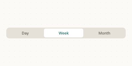
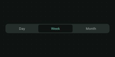
Each design picks its own look: brand draws pills, a muted track with the active tab raised on it; iOS draws a segmented control; Material and the web draw an underline. Set variant to use the same look everywhere.
<VStack gap="lg">
  {['pills', 'underline'].map((variant) => (
    <Tabs key={variant} defaultValue="day" variant={variant}>
      <TabsList aria-label={`Range, ${variant}`}>
        <TabsTrigger value="day">Day</TabsTrigger>
        <TabsTrigger value="week">Week</TabsTrigger>
        <TabsTrigger value="month">Month</TabsTrigger>
      </TabsList>
    </Tabs>
  ))}
</VStack>
A mailbox with icons
icon puts any node before the label. A disabled tab can't be picked, and arrow keys skip it.
<Tabs defaultValue="inbox">
  <TabsList aria-label="Mail">
    <TabsTrigger value="inbox" icon={<Text>✉</Text>}>Inbox</TabsTrigger>
    <TabsTrigger value="starred" icon={<Text>★</Text>}>Starred</TabsTrigger>
    <TabsTrigger value="spam" disabled>Spam</TabsTrigger>
  </TabsList>
</Tabs>
Preferences in a side column
orientation="vertical" puts the list beside the content, as in a settings page. Up and down arrows move through it.
<Tabs defaultValue="general" orientation="vertical" variant="underline">
  <TabsList aria-label="Preferences">
    <TabsTrigger value="general">General</TabsTrigger>
    <TabsTrigger value="privacy">Privacy</TabsTrigger>
    <TabsTrigger value="advanced">Advanced</TabsTrigger>
  </TabsList>
  <TabsContent value="general">
    <Text>Language and region.</Text>
  </TabsContent>
  <TabsContent value="privacy">
    <Text>Who can see your profile.</Text>
  </TabsContent>
  <TabsContent value="advanced">
    <Text>Developer options.</Text>
  </TabsContent>
</Tabs>
Keeping a panel mounted
Only the active panel is mounted, so a panel's state resets when you leave it. forceMount keeps it mounted and hidden instead, for a form the user shouldn't lose.
A profile screen
Tabs over real panels: each one holds its own list, and the count in a label tells people what's inside before they switch.
<Card style={{ maxWidth: 420, width: '100%' }}>
  <CardContent style={{ paddingTop: 16, gap: 16 }}>
    <HStack gap="md" align="center">
      <Avatar size="lg" name="Maya Cohen" src="https://picsum.photos/id/64/160/160" />
      <VStack>
        <Text weight="semibold" size="lg">Maya Cohen</Text>
        <Text color="textSecondary">@maya · Product designer</Text>
      </VStack>
    </HStack>
    <Tabs defaultValue="posts">
      <TabsList aria-label="Profile">
        <TabsTrigger value="posts">Posts</TabsTrigger>
        <TabsTrigger value="followers">Followers</TabsTrigger>
        <TabsTrigger value="about">About</TabsTrigger>
      </TabsList>
      <TabsContent value="posts">
        <List>
          {POSTS.map((title, i) => (
            <ListItem key={title} title={title} description={`${i + 2}h ago`} onPress={() => {}} />
          ))}
        </List>
      </TabsContent>
      <TabsContent value="followers">
        <List>
          {FOLLOWERS.map((name) => (
            <ListItem key={name} title={name} leading={<Avatar size="sm" name={name} />} trailing={<Badge variant="secondary">Follows you</Badge>} />
          ))}
        </List>
      </TabsContent>
      <TabsContent value="about">
        <Text color="textSecondary">Designing calm interfaces in Tel Aviv. Previously at a fintech, now building tools for designers.</Text>
      </TabsContent>
    </Tabs>
  </CardContent>
</Card>
Designs
- Patine: shadcn's look, a muted track with the active tab on a raised pill, sized to its labels. Pills are 36pt tall and grow to a 44pt touch area.
- iOS: a segmented control that shares the list's width.
- Material: Material 3 primary tabs. They share the width, and a 3dp indicator slides under the active label.
- Web: tabs sized to their labels with a line under the active one, as on GitHub and in most web apps.
Guidelines
Use short, parallel labels. One or two words each, the same kind of thing.
Don't write sentences on tabs. Long labels wrap or scroll and are hard to scan.
Switch views of the same thing. Tabs change what's shown, not where you are in the app.
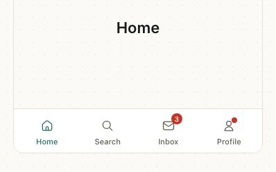
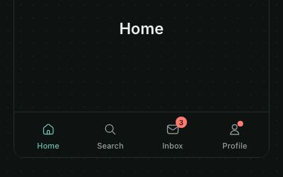
Don't use tabs to navigate the app. Home, Search and Profile belong in a bottom tab bar.
Tabs or segmented control?
Use tabs to switch between panels of content. Use a segmented control to pick a value, such as a filter or a view mode, that changes what's on the same screen.
Accessibility
| Behaviour | |
|---|---|
| Role | TabsList is a tablist, each trigger a tab, each panel a tabpanel; on the web a tab names its panel with aria-controls. Name the list with aria-label. |
| Announced | selected on the active tab, disabled on disabled ones. |
| Keyboard (web) | Only the active tab is in the Tab order. Arrows move to the next tab and select it (up and down when vertical), skipping disabled ones and wrapping; Home and End go to the ends. |
| Touch target | Every tab has at least a 44pt touch area, and a focus ring when it's reached by keyboard. |
| Reduce motion | The indicator jumps instead of sliding. |
API
Tabs
Tabs also takes React Native's View props.
| Prop | Type | Default | Description |
|---|---|---|---|
value | string | — | The active tab's value, controlled. |
defaultValue | string | — | The active tab when uncontrolled. |
onValueChange | (value: string) => void | — | Called when the user picks a tab. |
orientation | 'horizontal' | 'vertical' | 'horizontal' | A row of tabs above the content, or a column beside it. |
variant | 'pills' | 'underline' | from the design | A raised pill on a track, or a line under the active tab. |
items | TabsItem[] | — | Shorthand: { value, label, content, icon?, disabled? } for each tab. The first enabled one opens first. |
children | ReactNode | — | A TabsList and the TabsContents, when you don't give items. |
theme | DeepPartial<Theme> | — | Theme override. |
design | 'brand' | 'ios' | 'material' | 'web' | 'native' | from PatineProvider | The look to follow: brand, iOS, Material or web, or 'native' for the platform's own. |
TabsList
Takes React Native's View props, such as aria-label and style.
| Prop | Type | Default | Description |
|---|---|---|---|
children | ReactNode | Required | The TabsTriggers, as direct children so the indicator can find them. |
TabsTrigger
Also takes React Native's Pressable props, such as accessibilityLabel.
| Prop | Type | Default | Description |
|---|---|---|---|
value | string | Required | The value it selects, matching a TabsContent. |
children | ReactNode | Required | The label. A string is drawn in the tab's text color. |
icon | ReactNode | — | Before the label. |
disabled | boolean | false | Can't be picked; arrow keys skip it. |
style | StyleProp<ViewStyle> | — | The tab. |
styles | { label?: StyleProp<TextStyle> } | — | Style slots: the label. |
TabsContent
Also takes React Native's View props.
| Prop | Type | Default | Description |
|---|---|---|---|
value | string | Required | The tab that shows it. |
forceMount | boolean | false | Keeps it mounted, hidden, while another tab is active. |
children | ReactNode | Required | The panel. |
Right to left and custom styles work the same on every component: see Internationalization and right to left and Styling.
For AI
Give this page to an assistant as Markdown, with Copy page at the top, or the whole API in llms-full.txt.
With the Patine MCP server, it asks for get_component_docs({ name: "Tabs" })