Select
Select is a React Native form field that opens a searchable list: in a bottom sheet on phones, a dropdown under the field on the web, or a centered modal (presentation). Single or multiple selection, with groups, icons, descriptions, chips, a clear button and search on your server. It follows the iOS, Material or web design: a ✓ or radios, rounded or edge-to-edge rows.
<Select
  label="Favourite fruit"
  placeholder="Pick one"
  options={fruits}
  value={fruit}
  onValueChange={setFruit}
/>
Select doesn't store the selection itself. Pass value and update it from onValueChange.
Try the props
presentationerrordesign<Select
label="Fruit"
options={fruits}
value={value}
onValueChange={setValue}
searchable
/>
Examples
Each example is live: edit the code and it runs.
A shipping address
A checkout step: the country decides which regions the second select offers, the delivery options carry their price in description, and Continue flags the region left empty.
<VStack gap="md">
  <TextField label="Street address" defaultValue="1450 Mission St, Apt 4B" />
  <Select label="Country" options={COUNTRIES} value={country} onValueChange={chooseCountry} />
  <HStack gap="sm" align="flex-start">
    <Select
      label="State / region"
      placeholder="Choose"
      options={regions}
      value={region}
      onValueChange={setRegion}
      error={submitted && !region ? 'Required' : undefined}
      required
      style={{ flex: 3 }}
    />
    <TextField label="Postcode" defaultValue="94103" style={{ flex: 2 }} />
  </HStack>
  <Select label="Delivery" options={DELIVERY} value={delivery} onValueChange={setDelivery} />
  <Button onPress={() => setSubmitted(true)}>Continue to payment</Button>
</VStack>
Options
interface SelectOption<T> {
  label: string;           // row text, and what search matches first
  value: T;                // any type; compared with isEqual (default Object.is)
  description?: string;    // second line, also searchable
  icon?: React.ReactNode;  // leading element: flag, avatar, icon
  group?: string;          // section header
  disabled?: boolean;
  keywords?: string[];     // extra search terms, e.g. other languages or synonyms
}
<Select
  label="Ship to"
  options={countries}
  value={country}
  onValueChange={setCountry}
  searchable
/>
Groups appear in the order their first option appears in options. Options without a group are listed together without a header.
Uncontrolled
Leave value out and pass defaultValue to let the select keep its own selection, as a native <select> does. onValueChange still tells you what the user picks.
<Select label="Size" options={sizes} defaultValue="m" onValueChange={(size) => console.log(size)} />
Pick up to four skills
multiple switches value to an array and onValueChange to (values, options). The sheet gets checkboxes and a Done button, and the field shows removable chips (tap a chip to remove it). maxSelected caps the selection; once reached, the remaining options are disabled.
<Select
  multiple
  label="Skills (max 4)"
  placeholder="Add skills"
  options={skills}
  value={picked}
  onValueChange={setPicked}
  maxSelected={4}
  clearable
/>
Set chips={false} to show a comma-separated list instead of chips.
Search
As a dropdown (the default on the web), the user types right in the field to filter the options; searchable={false} keeps the field read-only. In a sheet, the search field appears automatically when there are more than 8 options; force it with searchable / searchable={false}. The default filter:
- matches
label,descriptionandkeywords - is case-insensitive and accent-insensitive (
cremefindsCrème), and ignores Hebrew niqqud - splits the query on spaces and requires every word to match (
new yofindsNew York)
Provide filterOption for your own logic, for example matching only from the start of the label:
<Select
  options={options}
  value={value}
  onValueChange={setValue}
  filterOption={(option, query) => option.label.toLowerCase().startsWith(query.toLowerCase())}
/>
The default is exported as defaultFilter, so you can extend it:
import { defaultFilter } from 'patine-ui';

filterOption={(o, q) => defaultFilter(o, q) || o.value === q.toUpperCase()}
Create new options
onCreate lets the user add what they typed: while no option's label matches the search, ignoring case and accents, a last row offers Add "…". It gets the trimmed text; add the new option to options and return it to select it, as for tags, recipients or your own categories. The search clears, so the next one can be typed straight away.
<Select
  label="Tags"
  multiple
  searchable
  options={tags}
  value={selected}
  onValueChange={setSelected}
  onCreate={(text) => {
    const tag = { label: text, value: text.toLowerCase() };
    setTags((current) => [...current, tag]);
    return tag;
  }}
/>
createLabel words the row, e.g. createLabel={(text) => `Create tag "${text}"`}. Return nothing from onCreate to add the option without selecting it, or to save it on your server first and select it once it's there. The row isn't offered at maxSelected, and with server search it waits for the results and checks their labels.
Search on a server
Pass loadOptions and the picker runs the search for you. It waits for a pause in typing (searchDebounce, 300 ms by default), shows the loader from the keystroke until the results arrive, and ignores answers to older queries. Before the user types, it lists options; with none, like here, it shows searchPrompt (default Type to search). A search with no results shows emptyText.
<Select
  label="City"
  placeholder="Search a city"
  value={city}
  onValueChange={setCity}
  loadOptions={searchCities}
  searchPrompt="Type a city"
  emptyText="No city matches"
/>
- Search field from the start, even with no
options. - No double filtering: results are listed as
loadOptionsreturns them. PassfilterOptionto filter anyway. - The selected label stays in the field after a new search drops it from the results.
- A failed request shows
emptyText.
For a whole form built this way, see the flight search form example.
Searching yourself
For full control (pagination, caching, your own state), use onSearchChange instead: it's called with the query once typing pauses, and you set options and loading. With options showing, loading puts the spinner under them, which suits onEndReached for loading the next page. See the Search a server example.
renderLoading replaces the spinner and text with your own element:
<Select
  // …
  loading={loading}
  renderLoading={(theme) => <Text style={{ color: theme.colors.textSecondary }}>Asking the server…</Text>}
/>
Clearing
clearable shows a × in the field when something is selected.
- In multiple mode, × calls
onValueChange([], [])and thenonClear. - In single mode, × calls only
onClear. Reset your state there:
<Select
  label="Priority"
  clearable
  onClear={() => setV(null)}
  options={[
    { label: 'Low', value: 'a' },
    { label: 'Medium', value: 'b' },
    { label: 'High', value: 'c', description: 'Pages on-call' },
  ]}
  value={v}
  onValueChange={setV}
/>
Errors and helper text
error shows the field as invalid: a red border and label, and the message under the field when it's a string. helperText is the line under the field while there's no error message, and required adds an asterisk to the label. Your form decides what's invalid; see Forms.
<Select
  label="Tags"
  multiple
  required
  helperText="Up to 3"
  error={tags.length === 0 && 'Pick at least one tag'}
  maxSelected={3}
  options={['Bug', 'Feature', 'Docs', 'Design'].map((t) => ({ label: t, value: t }))}
  value={tags}
  onValueChange={setTags}
/>
Closing behaviour
In single mode, the value changes as soon as an option is tapped and the sheet or dropdown closes (closeOnSelect, default true); the row's ripple finishes while it animates out. With closeOnSelect={false} a sheet or modal stays open and shows a Done button. In a sheet or modal, multiple mode always shows Done. A dropdown has no Done button: a tap outside closes it, and a second tap on the field folds an inline list. onOpenChange fires with true and false when the user opens and closes the list. Control it with open, or start it open with defaultOpen.
Choose a framework, with hover and ripple
Rows tint while the pointer is over them and ripple from the touch point when picked; in single mode the ripple finishes as the list closes. The field tints on hover but doesn't ripple. Both colours come from the theme, so a brand tint is one prop:
<Select
  label="Framework"
  placeholder="Choose a framework"
  options={frameworks}
  value={framework}
  onValueChange={setFramework}
  theme={{
    colors: {
      hover: 'rgba(200,70,13,0.08)',
      ripple: 'rgba(200,70,13,0.24)',
    },
  }}
/>
See Theming → Hover and ripple to change them everywhere or turn them off.
Custom trigger
renderTrigger replaces the field. Call open() to show the sheet:
<Select
  options={sorts}
  value={sort}
  onValueChange={setSort}
  sheetTitle="Sort by"
  renderTrigger={({ open, selected }) => (
    <Pressable
      onPress={open}
      style={{
        alignSelf: 'flex-start',
        paddingVertical: 8,
        paddingHorizontal: 14,
        borderRadius: 999,
        backgroundColor: '#EEF2FF',
      }}
    >
      <Text style={{ color: '#C8460D', fontWeight: '600' }}>
        ↕ {selected[0]?.label ?? 'Sort'}
      </Text>
    </Pressable>
  )}
/>
Custom chevron
The field's chevron rotates when it opens and closes. renderChevron swaps the icon and keeps the rotation, so any icon works, an SVG included:
<Select
  label="Size"
  options={sizes}
  value={size}
  onValueChange={setSize}
  renderChevron={({ theme }) => (
    <Text style={{ color: theme.colors.primary, fontSize: 16 }}>⌄</Text>
  )}
/>
Custom options
renderOption replaces each row's content (taps, selection background and accessibility are still handled). renderGroupHeader replaces section headers.
      <View
        style={{
          flexDirection: 'row',
          alignItems: 'center',
          gap: 12,
          flex: 1,
        }}
      >
        <View
          style={{
            width: 36,
            height: 36,
            borderRadius: 18,
            backgroundColor: p.color,
            alignItems: 'center',
            justifyContent: 'center',
          }}
        >
          <Text style={{ color: 'white', fontWeight: '700' }}>
            {p.label[0]}
          </Text>
        </View>
        <View style={{ flex: 1 }}>
          <Text
            style={{
              color: theme.colors.text,
              fontWeight: selected ? '700' : '500',
            }}
          >
            {p.label}
          </Text>
          <Text style={{ color: theme.colors.textSecondary, fontSize: 12 }}>
            {p.description}
          </Text>
        </View>
        {selected && <Text style={{ color: theme.colors.primary }}>●</Text>}
      </View>
    );
  }}
/>
Presentation
presentation picks how the options open:
'auto'(default): a dropdown on the web, a bottom sheet on native.'bottomSheet': always a bottom sheet.'modal': always a centered modal.'dropdown': a popover under the field, as wide as the field. It flips above the field when there's more room there, and a tap outside closes it.'inline': the list expands under the field, pushing the content below it, and folds back up on a second tap or once an option is picked (withcloseOnSelect). It's at most 320 px tall and scrolls past that.
<Select
  label="Framework"
  value={value}
  onValueChange={setValue}
  options={['Expo', 'React Native CLI', 'Next.js', 'Vite'].map((label) => ({
    label,
    value: label,
  }))}
/>
Sheet options
Customise the sheet through sheet, which takes PickerSheet props such as confirmLabel and sheetProps (passed through to BottomSheet):
<Select
  options={options}
  value={value}
  onValueChange={setValue}
  sheetTitle="Choose a city"
  sheet={{ confirmLabel: 'Apply', sheetProps: { height: 0.7, enableSwipeToClose: false } }}
  listHeight={400}
  autoFocusSearch
/>
Expanding the sheet
Long lists open at their content height and can grow to full screen: drag the header up on iOS and Android, or scroll the wheel up over the sheet on the web. The list grows with the sheet. Set the expanded height through sheet.sheetProps:
<Select
  label="Country"
  options={countries}
  value={country}
  onValueChange={setCountry}
  presentation="bottomSheet"
  sheet={{ sheetProps: { expandedHeight: 0.9, draggable: true } }}
/>
expandable: false keeps the sheet at its content height; draggable: false turns off dragging on native. See BottomSheet for all the options.
In real apps
Patine Pro screens built with it. Each opens on that screen, live, in the screens gallery.
Designs
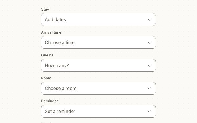
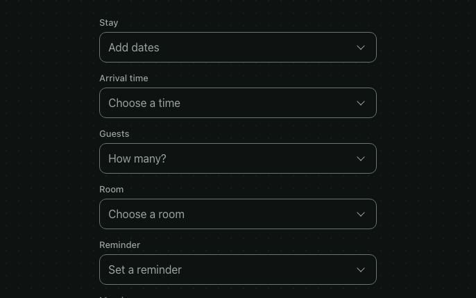
The field follows each platform's own: an iOS row with a chevron, Material's outlined field with the label on the border, and the web's compact box. The list opens as a sheet on a phone and a dropdown on a wide screen.
Guidelines
Use it for five or more options. A list in a sheet or dropdown keeps a long choice tidy.
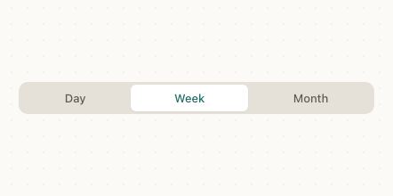
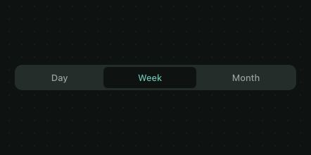
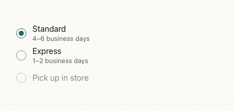
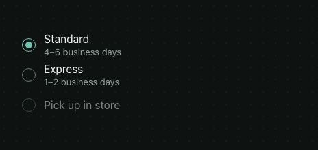
Don't hide two options in a select. With two or three, a radio group or segmented control shows every choice at once.
Turn on search for long lists. People type a few letters instead of scrolling 250 countries.
Don't write the instruction as the only label. “Select…” says nothing once a value is picked.
Accessibility
| Behaviour | |
|---|---|
| Role | The field is a button named by label (or the placeholder), with the selection as its hint; each option is a button (radio-like in the list). |
| Announced | expanded while open, selected on options, disabled; with required the label ends in ", required", and an error follows the selection in the hint. |
| Keyboard (web) | Enter, Space or the arrow keys open it; arrows move through options, Enter picks, Escape closes and focus returns to the field. Typing jumps to a match. |
| Touch target | The field is at least 44pt tall, and every option row is too. |
| Reduce motion | The sheet or dropdown appears without sliding. |
API
Select
Value
| Prop | Type | Default | Description |
|---|---|---|---|
options | ReadonlyArray<SelectOption<T>> | [] | The options; with loadOptions, the ones shown before the user types. |
multiple | boolean | false | Multi-select mode. |
value | T | null · T[] | — | Selected value(s), when you control it. |
defaultValue | T | null · T[] | none · [] | Selected at first when value is left out; the select then keeps its own. |
onValueChange | (value: T, option: SelectOption<T>) => void · (values: T[], options: SelectOption<T>[]) => void | — | Single · multiple. |
maxSelected | number | — | Multiple only: maximum selected options. |
isEqual | (a: T, b: T) => boolean | Object.is | Value equality. |
Field
| Prop | Type | Default | Description |
|---|---|---|---|
label | string | — | Label above the field (floating inside it in Material, above a renderTrigger); also the default sheet title. |
placeholder | string | 'Select…' | Shown when nothing is selected. |
disabled | boolean | false | Disable the field. |
clearable | boolean | false | Show a × button when something is selected. |
onClear | () => void | — | Called by ×. In single mode, reset value here. |
error | string | boolean | — | Shows the field as invalid, with the message under it when it's a string. See Errors and helper text. |
helperText | string | — | Shown under the field, replaced by the error message. |
required | boolean | false | Adds an asterisk to the label and tells screen readers the field is required. The value isn't checked. |
chips | boolean | true | Multiple: show selections as removable chips. |
renderChevron | (info: { open, theme }) => ReactNode | — | Custom chevron icon (an SVG, an icon font…). It still rotates on open and close. |
renderTrigger | (info: { open, selected, disabled, error }) => ReactNode | — | Replace the field entirely. |
style | StyleProp<ViewStyle> | — | Wrapper style (label + field). |
Sheet & list
| Prop | Type | Default | Description |
|---|---|---|---|
presentation | 'auto' | 'bottomSheet' | 'modal' | 'dropdown' | 'inline' | 'auto' | How the options open. auto: dropdown on the web, bottom sheet on native. |
sheetTitle | string | label | Sheet header title. |
closeOnSelect | boolean | true | Single: close on tap. false shows a Done button. |
sheet | Partial<SheetChromeProps> | — | confirmLabel, cancelLabel, showCancel, title, sheetProps. |
open | boolean | — | Open, when you control it. Pair with onOpenChange. |
defaultOpen | boolean | false | Open at first, when it keeps its own state. |
onOpenChange | (open: boolean) => void | — | The user opened or closed the list. Not called when open changes from your code. |
searchable | boolean | dropdown: true · sheet: options.length > 8, or with loadOptions / onSearchChange | Dropdown: type in the field to filter, or in a search field atop the list with renderTrigger. Sheet: show the search field. |
searchPlaceholder | string | 'Search' | Search hint. |
filterOption | (option, query) => boolean | defaultFilter; none with loadOptions / onSearchChange | Custom search. |
loadOptions | (query: string) => Promise<ReadonlyArray<SelectOption<T>>> | — | Search a server: loader, debounce and stale answers handled. An empty query shows options. |
onSearchChange | (query: string) => void | — | Called once typing pauses, to search yourself. |
searchPrompt | string | 'Type to search' | Shown before the user types, while a searched list has no options. |
searchDebounce | number | 300 | ms after the last keystroke before loadOptions / onSearchChange. |
onEndReached | () => void | — | Called near the end of the list, to load more. |
loading | boolean | false | Spinner in place of an empty list, or under the options. |
loadingText | string | 'Loading…' | Text next to the spinner. |
renderLoading | (theme) => ReactNode | — | Custom loader. |
emptyText | string | 'No results' | Shown when nothing matches. |
onCreate | (text: string) => SelectOption<T> | void | — | Offer the typed text as a new option when no label matches. Return the option to select it. |
createLabel | (text: string) => string | (text) => `Add "${text}"` | The create row's text. |
showCheckmarks | boolean | true | Check marks / checkboxes on rows. |
renderOption | (info: { option, selected, disabled, theme }) => ReactNode | — | Custom row content. |
renderGroupHeader | (group: string, theme) => ReactNode | — | Custom section header. |
listHeight | number | grows with content | Fixed list height. |
autoFocusSearch | boolean | false | Focus search when the sheet opens. |
styles | SlotStyles<SelectSlot | SelectTriggerSlot> | — | Slots for both the field and the list. |
theme | DeepPartial<Theme> | — | Theme override. |
design | 'brand' | 'ios' | 'material' | 'web' | 'native' | from PatineProvider | The look to follow, over the provider's: brand, iOS, Material or web, or 'native' for the platform's own. |
testID | string | — | Test ID on the list. |
Slots
Field (SelectTriggerSlot):
| Slot | Element |
|---|---|
label | The label: above the field, or the floating label in the Material design |
trigger | The field box |
triggerText | Selected label(s) |
placeholder | Placeholder text |
chip / chipText | Multi-select chips |
chevron | The drawn chevron (a bordered View: borderColor sets its color, width / height its size); in the Material design, a triangle colored by borderTopColor |
clear | × button text |
helperText | The line under the field: helper text or the error message |
List: see SelectList slots.
Right to left and custom styles work the same on every component: see Internationalization and right to left and Styling.
For AI
Give this page to an assistant as Markdown, with Copy page at the top, or the whole API in llms-full.txt.
With the Patine MCP server, it asks for get_component_docs({ name: "Select" })
Related
- Tag picker example
- Search a server example: loading, debounced search and load-more
- Dependent selects example: country, then state, then city
- Flight search form example: a full form with airports searched on a server