Switch
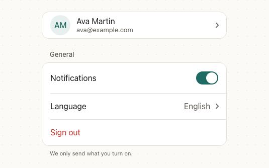
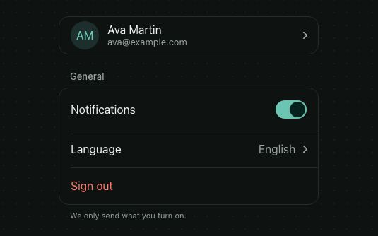
A toggle for a setting that takes effect right away. The label and the switch are one row, and pressing either flips it.
<Card style={{ maxWidth: 420, width: '100%' }}>
  <CardHeader>
    <CardTitle>Notifications</CardTitle>
    <CardDescription>Choose what we send to this device.</CardDescription>
  </CardHeader>
  <CardContent style={{ gap: 4 }}>
    <Switch label="Push notifications" description="Turn off to pause everything below" checked={push} onCheckedChange={setPush} />
    <Separator />
    <Switch label="Replies and mentions" defaultChecked disabled={!push} />
    <Switch label="New followers" disabled={!push} />
    <Switch label="Weekly digest" description="Every Monday at 9:00" defaultChecked disabled={!push} />
  </CardContent>
</Card>
Try the props
descriptioncontrolPositiondesign<Switch
label="Push notifications"
description="Replies, mentions and new followers"
defaultChecked
/>
Examples
Each example is live: edit the code and it runs.
Do not disturb
A phone's Focus settings: the main switch turns the mode on, the schedule shows only while it's on, and the exception below it stays available but dims when the mode is off.
<Box border radius="lg" padding="md" gap="sm" style={{ width: '100%', maxWidth: 420 }}>
  <Switch label="Do Not Disturb" description={on ? 'Calls and notifications are silenced' : 'Off'} checked={on} onCheckedChange={setOn} />
  {on ? (
    <VStack gap="sm">
      <Separator />
      <Switch label="On a schedule" checked={scheduled} onCheckedChange={setScheduled} />
      {scheduled ? (
        <HStack gap="sm">
          <TimePickerField label="From" value={from} onConfirm={setFrom} style={{ flex: 1 }} />
          <TimePickerField label="To" value={to} onConfirm={setTo} style={{ flex: 1 }} />
        </HStack>
      ) : null}
    </VStack>
  ) : null}
  <Separator />
  <Switch label="Allow calls from favorites" description="Repeated calls within 3 minutes also ring" defaultChecked disabled={!on} />
  <Text size="sm" color="textSecondary">Your status shows as “Notifications silenced” in Messages.</Text>
</Box>
Wireless settings
The switch sits after the label by default, as in iOS Settings. Use controlPosition="start" to put it first.
<VStack gap="xs">
  <Switch label="Wi-Fi" defaultChecked />
  <Separator />
  <Switch label="Bluetooth" />
  <Separator />
  <Switch label="Airplane mode" disabled />
</VStack>
Dark mode with a reset
Pass checked and update it in onCheckedChange, or leave both out and use defaultChecked. onCheckedChange fires for the user's flips only, never when you change checked yourself.
<VStack gap="md" style={{ maxWidth: 360 }}>
  <Switch label="Dark mode" checked={dark} onCheckedChange={setDark} />
  <View style={{ padding: 16, borderRadius: 12, backgroundColor: dark ? '#111827' : '#F3F4F6' }}>
    <Text style={{ color: dark ? '#F9FAFB' : '#111827' }}>Preview: {dark ? 'dark' : 'light'} theme</Text>
  </View>
  <HStack gap="sm">
    <Button size="sm" variant="outline" onPress={() => setDark(false)}>Reset</Button>
  </HStack>
</VStack>
Async toggle: two-step verification
When flipping it starts a request, flip it at once, set loading until the request settles, and flip it back if it fails. While loading a spinner turns in the thumb, presses are ignored and screen readers hear it as busy; the switch keeps showing the new state.
<View style={{ height: 220, maxWidth: 420 }}>
  <Switch
    label="Two-step verification"
    description={saving ? 'Saving…' : 'Ask for a code when you sign in on a new device'}
    checked={twoStep}
    loading={saving}
    onCheckedChange={onChange}
  />
  <Toaster />
</View>
Privacy permissions in a list
A switch on its own, such as in a List row or a table, needs an accessibilityLabel so screen readers can name it.
<List title="Privacy" footer="Location is only used while the app is open." style={{ maxWidth: 420 }}>
  <ListItem title="Location" leading={<Icon name="mapPin" />} trailing={<Switch accessibilityLabel="Location" defaultChecked />} />
  <ListItem title="Camera" leading={<Icon name="camera" />} trailing={<Switch accessibilityLabel="Camera" />} />
  <ListItem title="Contacts" leading={<Icon name="users" />} trailing={<Switch accessibilityLabel="Contacts" disabled />} />
</List>
In real apps
Patine Pro screens built with it. Each opens on that screen, live, in the screens gallery.
Designs
Each design draws its platform's switch: iOS's wide green track, Material 3's thumb that grows when on, and a compact web toggle.
Guidelines
Apply the change at once. Flipping it is the save; nothing else to press.
Don't wait for a Save button. A switch that does nothing until Save looks broken; use a checkbox.
Say why it's off when it's disabled. The description explains what to change.
Don't label it with its state. “On” or “Off” as the label hides what it controls.
Switch or checkbox?
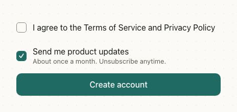
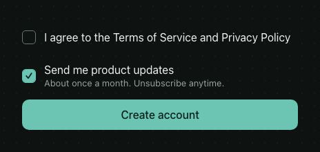
Use a switch for a setting that applies as soon as it's flipped. Use a checkbox for a choice that's sent with a form.
Accessibility
| Behaviour | |
|---|---|
| Role | switch, named by its label and described by its description. |
| Announced | checked, disabled, and busy while loading. |
| Keyboard (web) | Space flips it; a focus ring shows on keyboard focus, not after a click. |
| Touch target | The row is the touch target, at least 44pt tall. |
| Reduce motion | The thumb moves without sliding, and a loading thumb shows three still dots instead of a spinner. |
- While
loading, the switch is announced busy (aria-busy) and ignores presses, but stays focusable and keeps its state, so nothing else is announced until you changechecked. - Without a
label, passaccessibilityLabel. A disabled switch stays readable, so say why it's off in its description.
API
Switch
Switch also takes React Native's Pressable props, such as disabled (dims it and blocks flipping) and accessibilityLabel (its name for screen readers, for a switch without a label).
| Prop | Type | Default | Description |
|---|---|---|---|
checked | boolean | — | Controlled state. |
defaultChecked | boolean | false | Initial state when uncontrolled. |
onCheckedChange | (checked: boolean) => void | — | Called when the user flips it. |
loading | boolean | false | Waiting on the change it started: a spinner in the thumb, presses ignored, announced busy. |
label | ReactNode | — | Text next to the switch. Pressing it flips too. |
description | ReactNode | — | Secondary text under the label. |
controlPosition | 'start' | 'end' | 'end' | Which side of the label the switch sits on. |
style | StyleProp<ViewStyle> | — | The row. |
styles | { label?: StyleProp<TextStyle> } | — | Style slots: the label. |
theme | DeepPartial<Theme> | — | Theme override. |
design | 'brand' | 'ios' | 'material' | 'web' | 'native' | from PatineProvider | The look to follow: brand, iOS, Material or web, or 'native' for the platform's own. |
Right to left and custom styles work the same on every component: see Internationalization and right to left and Styling.
For AI
Give this page to an assistant as Markdown, with Copy page at the top, or the whole API in llms-full.txt.
With the Patine MCP server, it asks for get_component_docs({ name: "Switch" })