DatePicker & Calendar
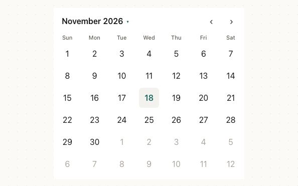
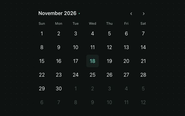
DatePicker is a React Native date picker that shows a month calendar. It supports single, range and multiple selection, min / max dates, disabled days, dots and labels under days, swipe navigation, a quick month jump and any locale.
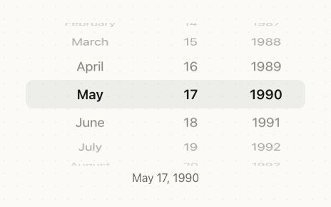
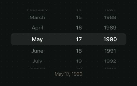
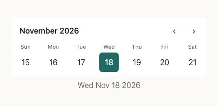
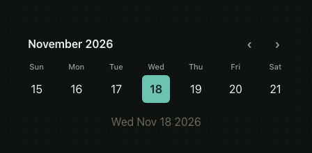
DatePickeris the entry point. Withdisplay="calendar"(the default) it renders aCalendar, and withdisplay="wheel"it renders aDateWheelPicker.Calendaris whatDatePickerrenders by default, with the same props minusdisplay.<DatePicker />and<Calendar />look and behave the same; importCalendardirectly if you never need the wheel.
<>
  <DatePicker value={date} onValueChange={setDate} />
  <Text style={{ textAlign: 'center', color: '#6E685E' }}>
    {date
      ? formatDate(date, undefined, { dateStyle: 'full' })
      : 'No date selected'}
  </Text>
</>
This page covers single selection and everything the calendar shares. Range and multiple selection are on the Date range & multiple page.
Try the props
displaymodeweekdayFormatfirstDayOfWeek<DatePicker
value={value}
onValueChange={setValue}
firstDayOfWeek={0}
/>
Examples
Each example is live: edit the code and it runs.
Book an appointment
A clinic's booking screen: weekends are closed, fully booked days are marked and disabled, and the open times show once a day is picked.
<VStack gap="md">
  <VStack gap="xs">
    <Text weight="semibold">Dental cleaning · 45 min</Text>
    <Text size="sm" color="textSecondary">Dr. Amira Haddad, Harbor Street Clinic</Text>
  </VStack>
  <DatePicker
    value={day}
    onValueChange={pickDay}
    minDate={addDays(today, 1)}
    maxDate={addDays(today, 42)}
    isDateDisabled={isWeekend}
    markedDates={markedDates}
  />
  {day ? (
    <ChipGroup items={SLOTS} value={slot} onValueChange={setSlot} accessibilityLabel="Time" />
  ) : (
    <Text color="textSecondary">Pick a day to see the open times.</Text>
  )}
  <Button disabled={!when}>{when ? `Book ${when}` : 'Book appointment'}</Button>
</VStack>
Book within the next 60 days
Days outside [minDate, maxDate] are disabled (struck through). The arrows stop at the first and last allowed months, and the month grid greys out months outside the range. Only the day matters; the time of day is ignored.
<DatePicker
  value={date}
  onValueChange={setDate}
  minDate={today}
  maxDate={addDays(today, 45)}
/>
Skip weekends and holidays
isDateDisabled runs for every visible day. Return true to disable it.
<DatePicker
  value={date}
  onValueChange={setDate}
  initialMonth={new Date(2026, 11, 1)}
  isDateDisabled={(d) =>
    d.getDay() === 0 || d.getDay() === 6 || holidays.has(toDateKey(d))
  }
/>
You can also disable specific days through markedDates with disabled: true.
isDateDisabled is called up to 42 times per render. Avoid heavy work inside it; precompute a Set of disabled keys and check it with toDateKey.
Show busy days with dots and prices
markedDates is keyed by YYYY-MM-DD (local time; build keys with toDateKey). Each entry can have:
| Field | Type | Effect |
|---|---|---|
dots | string[] | Up to 3 coloured dots under the number (events, statuses) |
label | string | Small text under the number (prices, counts) |
textColor | string | Colour of the day number |
disabled | boolean | Disable the day |
<DatePicker value={date} onValueChange={setDate} markedDates={marks} />
Locale and first day of week
Month and weekday names come from Intl.DateTimeFormat for the locale you pass. firstDayOfWeek (0 = Sunday … 6 = Saturday) defaults to the locale's first day when Intl.Locale week info is available, else Sunday.
<View style={{ gap: 24 }}>
  <DatePicker
    value={date}
    onValueChange={setDate}
    locale="fr-FR"
    firstDayOfWeek={1}
  />
  <DatePicker
    value={date}
    onValueChange={setDate}
    locale="ja-JP"
    weekdayFormat="narrow"
  />
</View>
Navigation
- Arrows step one month. They're disabled at
minDate/maxDate. - Swipe left / right on the days to change month (
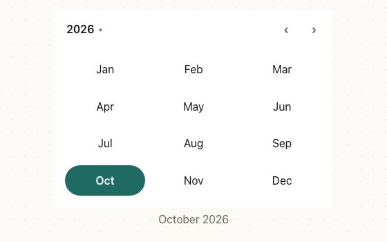
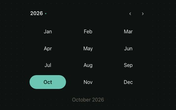
enableSwipe, on by default). The direction flips in RTL. - Quick jump: tap the month title to open a grid of months (the arrows step by year), tap the title again for a grid of years (the arrows step by 12 years), and tap it once more to go back to days. Picking a year opens its months, and picking a month opens its days (
enableQuickJump, on by default). The year grid showsyearRange, or 100 years either side of today, kept within theminDate/maxDateyears. initialMonthsets the first month shown. By default it's the month of the selected date (or range start, or first multiple date), else today.onMonthChange(month)fires with the first day of the newly shown month.
In single and range mode, when the selected date (or the range start) changes from outside to another month, the calendar follows it.
Layout
<DatePicker
  value={date}
  onValueChange={setDate}
  showOutsideDays={false}
  fixedWeeks={false}
  dayHeight={38}
  formatTitle={(month) =>
    month.toLocaleDateString('en-US', { month: 'short', year: '2-digit' })
  }
/>
fixedWeeks(defaulttrue) always renders 6 rows so the height never jumps between months. Set it tofalseto render only the weeks the month needs.showOutsideDays(defaulttrue) shows the trailing and leading days of neighbouring months (tappable, dimmed).dayHeight(default44) is the row height; the selection circle ismin(dayHeight − 4, 40).showWeekdays={false}hides the weekday header row.
Custom days and arrows
renderDay(state, theme) fully replaces a day cell's content (taps and the range band are still handled for you). renderArrow(direction, disabled) replaces the arrows.
<DatePicker
  value={date}
  onValueChange={setDate}
  renderArrow={(dir, disabled) => (
    <Text style={{ fontSize: 16, opacity: disabled ? 0.3 : 1 }}>
      {dir === 'prev' ? '⬅️' : '➡️'}
    </Text>
  )}
  renderDay={(s, theme) => (
    <View
      style={{
        width: 36,
        height: 36,
        borderRadius: 10,
        alignItems: 'center',
        justifyContent: 'center',
        backgroundColor: s.selected
          ? theme.colors.primary
          : s.today
            ? theme.colors.primaryMuted
            : 'transparent',
        opacity: s.outside ? 0.35 : 1,
      }}
    >
      <Text
        style={{
          color: s.selected
            ? theme.colors.onPrimary
            : s.disabled
              ? theme.colors.textDisabled
              : theme.colors.text,
          fontWeight: '600',
        }}
      >
        {s.date.getDate()}
      </Text>
    </View>
  )}
/>
DayState passed to renderDay:
interface DayState {
  date: Date;
  selected: boolean;   // the selected day, a range end, or one of multiple
  rangeStart: boolean;
  rangeEnd: boolean;
  inRange: boolean;    // strictly between start and end
  ranged: boolean;     // range or ranges mode: a chosen day is a range end
  today: boolean;
  disabled: boolean;
  outside: boolean;    // belongs to the previous / next month
  marking?: MarkedDate;
}
Styling
<DatePicker
  value={date}
  onValueChange={setDate}
  theme={{
    colors: { primary: '#059669', primaryMuted: 'rgba(5,150,105,0.12)' },
  }}
  styles={{
    container: {
      borderRadius: 20,
      borderWidth: 1,
      borderColor: '#E8E4DC',
      paddingHorizontal: 8,
    },
    headerTitle: { fontSize: 20, fontWeight: '800' },
    weekdayText: {
      textTransform: 'uppercase',
      fontSize: 10,
      letterSpacing: 1,
    },
    selectedDay: { borderRadius: 10 },
    todayDay: { borderRadius: 10 },
  }}
/>
Slots
| Slot | Element |
|---|---|
container | Outer view |
header | Title + arrows row |
headerTitle | Month / year title text |
arrow | Arrow button |
arrowText | Default arrow glyph |
weekdays | Weekday header row |
weekdayText | Weekday labels |
week | Each week row |
day | Day cell (pressable, full width of the column) |
dayInner | The circle inside the cell |
dayText | Day number |
selectedDay / selectedDayText | Selected circle / number |
todayDay / todayDayText | Today's circle / number |
disabledDayText | Disabled day numbers |
outsideDayText | Days from neighbouring months |
rangeBand | Range highlight band |
dot | Marked-date dots |
dayLabel | Marked-date label text |
gridCell / gridCellText | Month and year grid cells (quick jump) |
In a form field
DatePickerField is a field that opens a DatePickerSheet and shows the confirmed date. Switch presentation in the panel: auto opens a dropdown under the field on the web and a bottom sheet on iOS and Android.
presentationdisplay<DatePickerField
label="Due date"
placeholder="Pick a date"
value={date}
onConfirm={setDate}
/>
In real apps
Patine Pro screens built with it. Each opens on that screen, live, in the screens gallery.
Designs
The calendar draws each platform's own: iOS's red today and filled circles, Material 3's outlined today and tonal selection, and the web's compact grid.
Guidelines
Limit the range to bookable days. minDate, maxDate and disabled days stop a choice that would fail later.
Don't let people pick a date you'll reject. An error after the tap is slower than a day they can't press.
Use a wheel for a birthday. Years away from today are faster to spin to than to page through.
Don't make people page back 30 years. A month grid is for dates near today.
Accessibility
| Behaviour | |
|---|---|
| Role | Each day is a button labelled with the full date ("Wednesday, October 14, 2026"); the arrows are buttons labelled "Previous" and "Next". |
| Announced | selected and disabled on days; the title is a button when quick jump is on. |
| Keyboard (web) | Tab reaches the arrows and the days; Enter or Space picks a day. |
| Touch target | Days and arrows have at least a 44pt touch area. |
| Reduce motion | Months change without sliding. |
API
Calendar is the month grid on its own; DatePicker is the same calendar, or a wheel with display="wheel".
Calendar
Selection
| Prop | Type | Default | Description |
|---|---|---|---|
mode | 'single' | 'range' | 'multiple' | 'ranges' | 'single' | Selection mode; changes the type of value. |
value | Date | null · DateRange · Date[] · DateRange[] | — | Selection (controlled), typed by mode. |
defaultValue | same as value | null · {start:null,end:null} · [] · [] | Initial selection when uncontrolled. |
onValueChange | (date: Date) => void · (range: DateRange) => void · (dates: Date[]) => void · (ranges: DateRange[]) => void | — | Fires on every tap that changes the selection. |
presets | DateRangePreset[] | — | range only: chips that pick a whole range, such as getRangePresets(). |
presetsProps | RangePresetsListProps | — | range only: ChipGroup props for the presets row. |
minRangeDays | number | — | range and ranges. See range. |
maxRangeDays | number | — | range and ranges. |
allowSingleDayRange | boolean | true | range and ranges. |
maxSelections | number | — | multiple only. |
maxRanges | number | — | ranges only. |
Month view
| Prop | Type | Default | Description |
|---|---|---|---|
minDate | Date | — | Earliest selectable day. |
maxDate | Date | — | Latest selectable day. |
isDateDisabled | (date: Date) => boolean | — | Return true to disable a day. |
markedDates | Record<string, MarkedDate> | — | Keyed by YYYY-MM-DD: { dots?, label?, textColor?, disabled? }. |
locale | string | device | Month / weekday names and default first day. |
firstDayOfWeek | number (0–6) | from locale, else 0 | 0 = Sunday … 6 = Saturday. |
initialMonth | Date | selected date or today | Month shown first. |
onMonthChange | (month: Date) => void | — | Fires with the first day of the new month. |
showOutsideDays | boolean | true | Show neighbouring months' days. |
fixedWeeks | boolean | true | Always 6 rows. |
enableSwipe | boolean | true | Swipe horizontally to change months. |
enableQuickJump | boolean | true | Tap the title to cycle days → months → years. |
weekdayFormat | 'short' | 'narrow' | from the design: 'narrow' in Material, else 'short' | Mon vs M. |
showWeekdays | boolean | true | Show the weekday header. |
formatTitle | (month: Date, locale?: string) => string | "October 2026" | Custom title text. |
renderDay | (state: DayState, theme: Theme) => ReactNode | — | Custom day cell content. |
renderArrow | (direction: 'prev' | 'next', disabled: boolean) => ReactNode | — | Custom arrows. |
yearRange | [number, number] | ±100 years | Years available in the year grid, kept within minDate / maxDate. |
dayHeight | number | 44 | Height of a day row. |
style | StyleProp<ViewStyle> | — | Container style. |
styles | SlotStyles<CalendarSlot> | — | See slots. |
theme | DeepPartial<Theme> | — | Theme override. |
design | 'brand' | 'ios' | 'material' | 'web' | 'native' | from PatineProvider | The look to follow, over the provider's: brand, iOS, Material or web, or 'native' for the platform's own. |
testID | string | — | Test ID. |
DatePicker
Also takes every Calendar prop.
| Prop | Type | Default | Description |
|---|---|---|---|
display | 'calendar' | 'wheel' | 'calendar' | A month grid, or the wheels of DateWheelPicker. |
order, monthFormat, loop, itemHeight, visibleItems, variant, onValueChanging | With display="wheel": the wheel's props, as on DateWheelPicker. |
Types
interface DateRange { start: Date | null; end: Date | null }
interface MarkedDate { dots?: string[]; disabled?: boolean; label?: string; textColor?: string }
type CalendarProps = CalendarBaseProps & CalendarSelectionProps;
type DatePickerProps = ({ display?: 'calendar' } & CalendarProps) | ({ display: 'wheel' } & DateWheelPickerProps);
Right to left and custom styles work the same on every component: see Internationalization and right to left and Styling.
For AI
Give this page to an assistant as Markdown, with Copy page at the top, or the whole API in llms-full.txt.
With the Patine MCP server, it asks for get_component_docs({ name: "DatePicker" })