Card
A surface that groups related content and actions. Build it from its parts, as in shadcn/ui.
The quickest way: give Card a title, a description and a footer, and it draws the parts itself. Its children are the body.
<Card title="Pro plan" description="Billed monthly" footer={<Button>Upgrade</Button>}>
  <Text>Unlimited projects, priority support and early access to new features.</Text>
</Card>
Try the props
shadowonPressinteractivedesign<Card>
…
</Card>
Anatomy
<Card>              {/* the surface: background, border, radius, shadow */}
  <CardHeader>      {/* the top section */}
    <CardTitle />   {/* a heading */}
    <CardDescription />
  </CardHeader>
  <CardContent />   {/* the body */}
  <CardFooter />    {/* a row of actions */}
</Card>
For full control, leave those props out and build it from its parts.
<Card style={{ maxWidth: 360 }}>
  <CardHeader>
    <CardTitle>Pro plan</CardTitle>
    <CardDescription>Charts, scheduler and data grid.</CardDescription>
  </CardHeader>
  <CardContent>
    <Text size="2xl" weight="semibold">$199</Text>
  </CardContent>
  <CardFooter>
    <Button>Upgrade</Button>
    <Button variant="ghost">Compare plans</Button>
  </CardFooter>
</Card>
Examples
Each example is live: edit the code and it runs.
An order card
An account's orders page: each order is a card with its status, the items folded behind a toggle, and the next step in the footer.
<Card style={{ width: '100%', maxWidth: 420 }}>
  <CardHeader>
    <HStack justify="space-between" align="center">
      <CardTitle>Order #20417</CardTitle>
      <Badge variant="secondary">On its way</Badge>
    </HStack>
    <CardDescription>Placed Nov 14 · arrives Thursday, Nov 20</CardDescription>
  </CardHeader>
  <CardContent>
    <VStack gap="sm">
      <Progress value={70} accessibilityLabel="Delivery progress" />
      <Text size="sm" color="textSecondary">Left the Rotterdam depot this morning.</Text>
      <Button variant="link" size="sm" style={{ alignSelf: 'flex-start' }} onPress={() => setOpen(!open)}>
        {open ? 'Hide items' : `Show ${ITEMS.length} items`}
      </Button>
      {open
        ? ITEMS.map((item) => (
            <HStack key={item.name} justify="space-between">
              <Text>{item.qty} × {item.name}</Text>
              <Text>${item.qty * item.price}</Text>
            </HStack>
          ))
        : null}
      <Separator />
      <HStack justify="space-between">
        <Text weight="semibold">Total</Text>
        <Text weight="semibold">$107.00</Text>
      </HStack>
    </VStack>
  </CardContent>
  <CardFooter style={{ gap: 8 }}>
    <Button style={{ flex: 1 }}>Track package</Button>
    <Button variant="outline" style={{ flex: 1 }}>Return items</Button>
  </CardFooter>
</Card>
Notification settings in a card
<Card style={{ maxWidth: 380 }}>
  <CardHeader>
    <CardTitle>Notifications</CardTitle>
    <CardDescription>Choose what we tell you about.</CardDescription>
  </CardHeader>
  <CardContent>
    <VStack gap="xs">
      <Switch label="Comments" defaultChecked />
      <Separator />
      <Switch label="Mentions" defaultChecked />
      <Separator />
      <Switch label="Product updates" />
    </VStack>
  </CardContent>
  <CardFooter>
    <Button>Save</Button>
  </CardFooter>
</Card>
Pressable cards
Give a card onPress and the whole card is a button. With a mouse it rises on hover: a step or two up the shadow scale and, in brand and web, 2pt up. A press settles it back and shows the design's ripple or dim, and a keyboard focus draws a ring. The lift eases on the web and is instant with reduce motion on. interactive gives the hover and focus look without onPress, for a card inside your own link.
<VStack gap="md" style={{ maxWidth: 360, width: '100%' }}>
  {PLANS.map((plan) => (
    <Card key={plan.name} onPress={() => alert(plan.name)} accessibilityLabel={`${plan.name}, ${plan.price}`}>
      <CardHeader>
        <HStack justify="space-between">
          <CardTitle>{plan.name}</CardTitle>
          <Badge variant="secondary">{plan.price}</Badge>
        </HStack>
        <CardDescription>{plan.detail}</CardDescription>
      </CardHeader>
    </Card>
  ))}
</VStack>
A rental listing with a photo
Put an image straight in the card, before the header, and clip it with overflow: 'hidden' so it follows the card's corners.
<Card style={{ maxWidth: 340, width: '100%', overflow: 'hidden' }}>
  <Image source={{ uri: 'https://picsum.photos/id/1039/680/360' }} style={{ height: 170 }} accessibilityIgnoresInvertColors alt="A waterfall in a forest" />
  <CardHeader>
    <HStack justify="space-between" align="center">
      <CardTitle>Cabin by the falls</CardTitle>
      <HStack gap="xs" align="center">
        <Icon name="star" size="sm" color="warning" />
        <Text>4.92</Text>
      </HStack>
    </HStack>
    <CardDescription>Entire cabin · 2 guests · 1 bedroom</CardDescription>
  </CardHeader>
  <CardContent>
    <HStack gap="xs">
      <Badge variant="secondary">Wi-Fi</Badge>
      <Badge variant="secondary">Fireplace</Badge>
      <Badge variant="success">Free cancellation</Badge>
    </HStack>
  </CardContent>
  <CardFooter style={{ justifyContent: 'space-between', alignItems: 'center' }}>
    <Text><Text weight="semibold">$184</Text> night</Text>
    <Button>Reserve</Button>
  </CardFooter>
</Card>
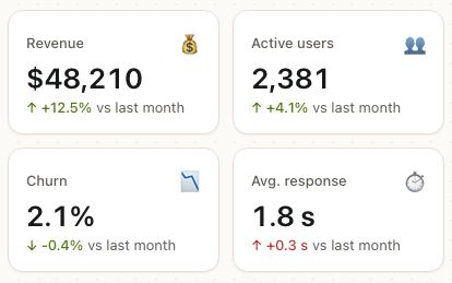
Stats on a dashboard
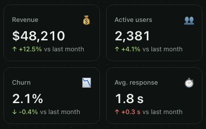
Small cards in a wrapping row make a dashboard. shadow="none" keeps a grid of them calm.
<HStack gap="md" wrap>
  {STATS.map((stat) => (
    <Card key={stat.label} shadow="none" style={{ minWidth: 120, flexGrow: 1 }}>
      <CardContent style={{ gap: 4, paddingTop: 16 }}>
        <CardDescription>{stat.label}</CardDescription>
        <Text size="2xl" weight="semibold">{stat.value}</Text>
        <Badge variant={stat.up ? 'success' : 'destructive'} style={{ alignSelf: 'flex-start' }}>
          {stat.change}
        </Badge>
      </CardContent>
    </Card>
  ))}
</HStack>
A profile card
<Card style={{ maxWidth: 360, width: '100%' }}>
  <CardContent style={{ paddingTop: 20, gap: 16 }}>
    <HStack gap="md" align="center">
      <Avatar size="lg" name="Maya Cohen" src="https://picsum.photos/id/64/160/160" />
      <VStack style={{ flex: 1 }}>
        <Text weight="semibold" size="lg">Maya Cohen</Text>
        <Text color="textSecondary">Product designer · Tel Aviv</Text>
      </VStack>
    </HStack>
    <HStack justify="space-around">
      {[['128', 'Posts'], ['4.2k', 'Followers'], ['310', 'Following']].map(([n, label]) => (
        <VStack key={label} align="center">
          <Text weight="semibold">{n}</Text>
          <Text size="sm" color="textSecondary">{label}</Text>
        </VStack>
      ))}
    </HStack>
    <HStack gap="sm">
      <Button style={{ flex: 1 }}>Follow</Button>
      <Button variant="outline" style={{ flex: 1 }}>Message</Button>
    </HStack>
  </CardContent>
</Card>
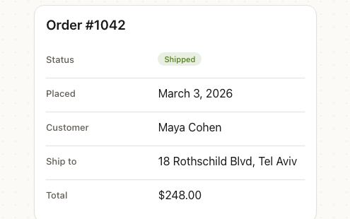
An invoice that loads
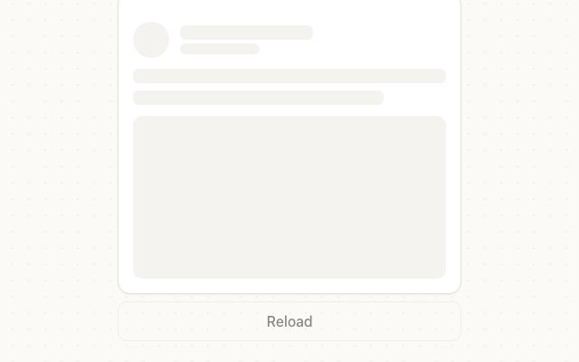
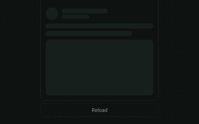
While the data loads, draw the same card with Skeleton blocks in place of the text, so the layout doesn't jump.
<VStack gap="sm" style={{ maxWidth: 360, width: '100%' }}>
  <Card>
    <CardHeader>
      {loading ? <Skeleton width="60%" height={20} /> : <CardTitle>Invoice #1042</CardTitle>}
      {loading ? <Skeleton width="40%" /> : <CardDescription>Due March 31 · Acme Inc.</CardDescription>}
    </CardHeader>
    <CardContent>{loading ? <Skeleton height={32} width={120} /> : <CardTitle>$2,400.00</CardTitle>}</CardContent>
  </Card>
  <Button variant="outline" onPress={() => setLoading(true)} disabled={loading}>Reload</Button>
</VStack>
Shadow
shadow picks a level on the theme's scale: 'none', 'xs', 'sm', 'md', 'lg' or 'xl'. To change every card's shadow (and every other component's), override shadows in PatineProvider; see Shadows and elevation.
<Card shadow="lg">…</Card>
<PatineProvider theme={{ shadows: { xs: '0px 1px 3px rgba(0,0,0,0.12)' } }}>…</PatineProvider>
In real apps
Patine Pro screens built with it. Each opens on that screen, live, in the screens gallery.
Designs
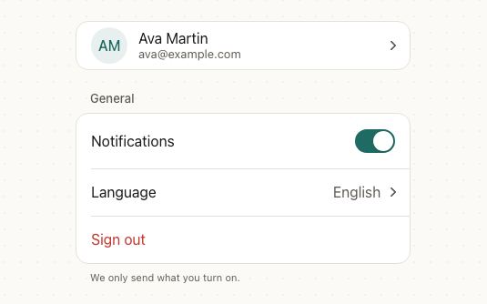
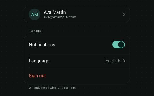
Patine, Material and the web outline the card; Patine and the web rest it on the xs shadow. iOS groups content on a filled surface with no border or shadow, as in its grouped tables.
Pro plan
Pro plan
Pro plan
Pro plan
Guidelines
Cabin by the falls
Keep its actions in the footer. People find them in the same place on every card.
Cabin
Don't scatter buttons through the card. Actions in the header and the body compete with the content.
Order #20417
Group things that belong together. One order, one person, one plan per card.
Don't put a card inside a card. Borders on borders add noise; use a separator or spacing.
Accessibility
| Behaviour | |
|---|---|
| Role | A plain container; with onPress it's a button named by its accessibilityLabel. CardTitle is a heading. |
| Announced | disabled on a pressable card. |
| Keyboard (web) | A pressable card takes Tab focus, shows a focus ring and presses with Enter or Space. |
| Touch target | A pressable card is far larger than 44pt; keep buttons in its footer at least that size. |
| Reduce motion | The hover lift is skipped with reduce motion on. |
- Give a pressable card an
accessibilityLabelthat names it, since a screen reader reads the label instead of every line inside.
API
Card
Card takes View props, and:
| Prop | Type | Default | Description |
|---|---|---|---|
shadow | 'none' | 'xs' | 'sm' | 'md' | 'lg' | 'xl' | the design's | Its elevation on the theme's shadow scale. |
onPress | (event) => void | — | Makes the whole card a button that rises on hover. |
href | string | — | Makes it a link: a real <a> on the web, Linking.openURL on iOS and Android after onPress (call event.preventDefault() to stop it). |
external | boolean | false | Opens href in a new tab on the web. |
onLongPress | (event) => void | — | Long press, on a pressable card. |
interactive | boolean | true with onPress | Hover lift and focus ring without onPress. |
disabled | boolean | false | Dims a pressable card and ignores presses. |
title | ReactNode | — | Shorthand: the CardTitle. With any shorthand prop, children go in a CardContent. |
description | ReactNode | — | Shorthand: the CardDescription. |
footer | ReactNode | — | Shorthand: the CardFooter's content, such as buttons. |
theme / design | The theme override and the look to follow, as on every component. |
CardHeader, CardContent and CardFooter
Take React Native's View props.
| Prop | Type | Default | Description |
|---|---|---|---|
theme | DeepPartial<Theme> | — | Theme override. |
CardTitle
| Prop | Type | Default | Description |
|---|---|---|---|
level, size, weight, font, color, theme, design | The props of Heading. |
CardDescription
| Prop | Type | Default | Description |
|---|---|---|---|
size, weight, font, color, theme, design | The props of Text. |
Right to left and custom styles work the same on every component: see Internationalization and right to left and Styling.
For AI
Give this page to an assistant as Markdown, with Copy page at the top, or the whole API in llms-full.txt.
With the Patine MCP server, it asks for get_component_docs({ name: "Card" })